Warriors: The New Prophecy Graphic Novel Complete Dossier
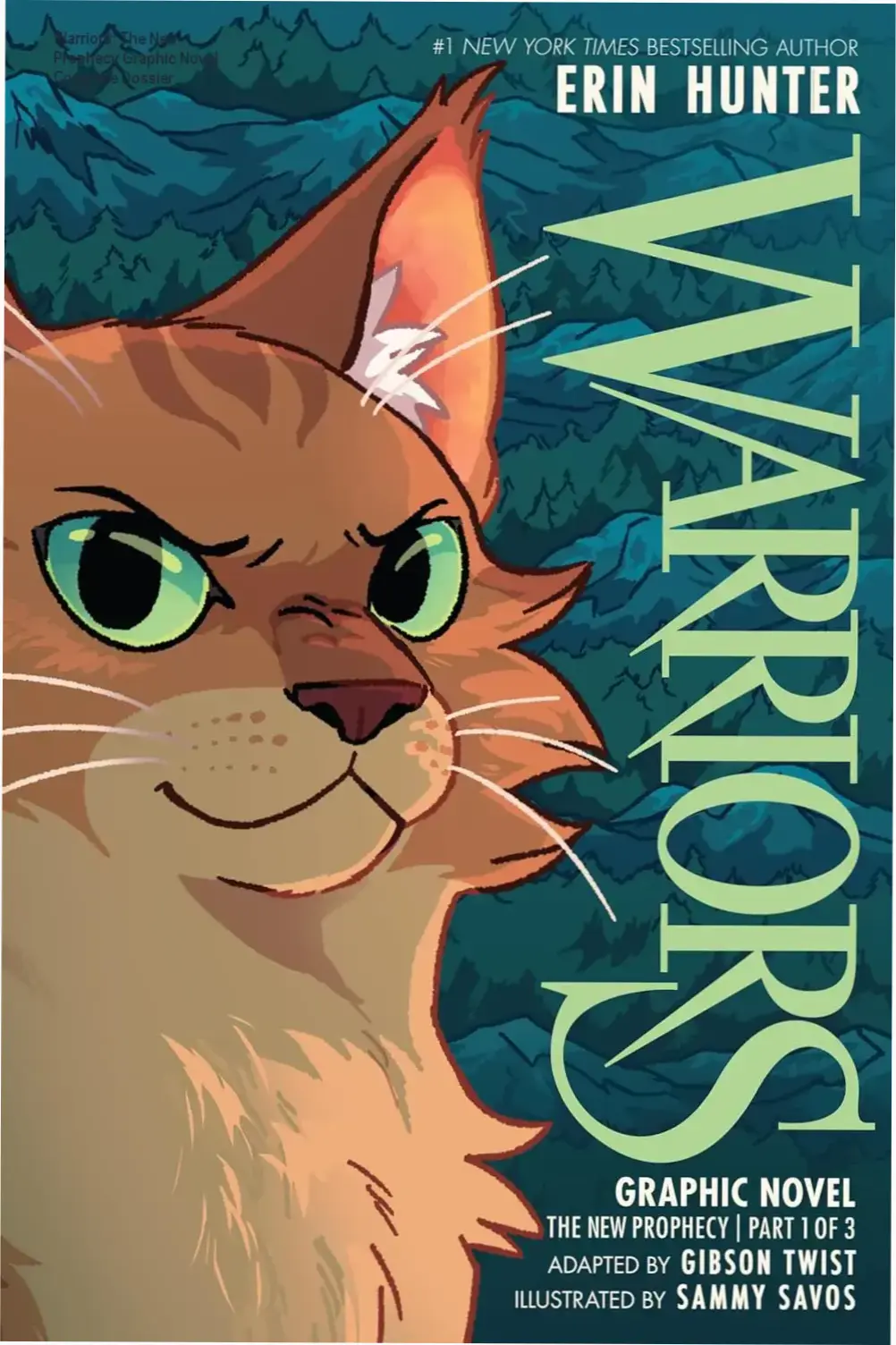
Translating a dense, internal-monologue-heavy fantasy series into a graphic novel format is a high-wire act. The Warriors books thrive on the scent of pine, the politics of the Clan meetings, and the intricate, often brutal internal lives of cats who cannot speak human words but think in complex strategies. When you strip the prose down to dialogue bubbles and visual panels, you risk losing the very soul of the series—the “why” behind the “what.” This adaptation of The New Prophecy arc (covering Midnight and Moonrise) attempts to bridge that gap, condensing two full novels into 272 pages of full-color sequential art. The stakes are higher here than in the first arc adaptation; the journey to the sun-drown-place introduces new geographies, the Tribe of Rushing Water, and a prophecy that fractures the established order. Readers expecting a 1:1 visual translation will immediately notice the compression. You can check the current edition details and reader reception here.
The core tension lies in the target demographic shift. The prose novels sit comfortably in middle grade but skew older as the series progresses, dealing with death, faith, and political maneuvering. The graphic novels, marketed heavily toward ages 9–12 (grades 3–7), must sanitize or accelerate certain beats to fit the page count and visual literacy of a younger audience. This creates a friction: longtime fans miss the nuance, while new readers get a sprint instead of a marathon. Sammy Savos takes over art duties from James L. Barry, bringing a distinctively sharper, more angular line work that defines this era visually. It’s a bold aesthetic pivot that signals a tonal shift—less cozy forest fantasy, more harsh survivalist journey.
Ready to dive into “Warriors Graphic Novel: The New Prophecy, Part One of Three”?
Explore available editions, check current live pricing, or download a free sample directly on Amazon.
Preview Free Sample & Check Price on Amazon
*You will be redirected to Amazon. As an Amazon Associate, we may earn from qualifying purchases.
Visual Identity: The Savos Shift
James L. Barry defined the look of the first three graphic novels. His style was softer, rounder, leaning into the “cute but dangerous” vibe of the early forest territory. Sammy Savos inherits the reins for The New Prophecy and immediately imposes a different visual language. The lines are heavier. The cats are angular, muscular, almost geometric in their construction. This isn’t just an art change; it’s a narrative signal. The journey to the mountains demands a harder edge.
Savos excels at environmental storytelling. The forest feels claustrophobic in the early panels—tight verticals, heavy shadows. Once the traveling cats (Brambleclaw, Feathertail, Crowpaw, Tawnypelt, Stormfur, Squirrelpaw) hit the open moor and eventually the mountains, the panels breathe. Double-page spreads of the mountain range carry genuine weight. The Tribe of Rushing Water cats look distinct—stockier, thicker fur rendered with a different texture brush—immediately communicating “different culture, different survival strategy” without a word of exposition.
However, the “same-face syndrome” plagues the background characters. In Clan gatherings or Tribe caves, generic warriors blur together. If you aren’t tracking fur color codes (tabby vs. solid, white patches), you lose track of who is speaking in crowd scenes. The color palette by Savos (often credited as solo colorist here) leans heavily into cool blues and slate greys for the mountain sections. It’s atmospheric, yes, but occasionally muddy in low-light scenes. The fire scene in the forest—crucial for Leafpaw’s arc—lacks the terrifying warmth it needs; it looks like orange ink on grey paper rather than a consuming inferno.
Pacing & Compression: The Cost of 272 Pages
Two novels. One volume. That is the math Gibson Twist (adapter) had to solve. Midnight and Moonrise combined run roughly 60
Who Should Read This—and Who Should Pass
This adaptation targets a specific sweet spot: readers aged 9–12 who crave visual storytelling but aren’t ready to abandon the Warriors universe for pure prose. It works brilliantly for reluctant readers; the full-color art by Sammy Savos carries heavy narrative lifting, decoding complex clan politics through expression and action rather than dense exposition. If you have a child who stalled on Midnight because the travelogue pacing dragged, this graphic novel compresses two novels into 272 pages without butchering the emotional beats.
Longtime fans buying for nostalgia need calibrated expectations. This is not a frame-for-frame translation. Gibson Twist’s adaptation trims subplots—Leafpaw’s medicine cat arc gets compressed, and several minor characters vanish entirely. Purists who treat the original text as scripture will notice missing scenes. The value proposition shifts: you’re paying for a curated, cinematic highlight reel, not a replacement library copy.
Skip it if: you expect the full “New Prophecy” arc. The cover says “Part One of Three,” covering only Midnight and Moonrise. Buying this expecting the journey’s end (Dawn, Starlight, Twilight, Sunset) is the most common purchasing error. It’s also a poor entry point for total newcomers; the cast is massive, and the graphic format assumes familiarity with clan terminology established in “The Prophecies Begin” arc.
Common misstep: purchasing the paperback expecting the “gorgeously illustrated case cover” mentioned in the blurb. That feature is exclusive to the hardcover edition. The paperback cover art is serviceable but lacks the embossed detail collectors want. Check the format dropdown carefully before checkout.
Quick Contextual FAQ
- Reading order: Read the “Prophecies Begin” graphic novels (Books 1–3) first. This is Book 4.
- Violence level: On par with the novels—implied predator attacks, character deaths, blood shown sparingly. PG territory.
- Art consistency: Savos maintains character designs across the shift from forest to mountain settings. No jarring style changes mid-book.
- Re-read value: High for art study; low for plot discovery once the prophecy mechanics are known.
Bottom line: this is the definitive visual gateway for the second arc. It respects the source material’s gravity while fixing its pacing flaws. For the target demographic, it’s arguably the superior format. You can verify current stock and reader photos here.
Final Editorial Verdict
“Warriors Graphic Novel: The New Prophecy, Part One of Three” delivers on its core promise for its intended audience, offering compelling insights without fluff. As highlighted in our detailed edition breakdown, its practical depth and readability are its greatest strengths.
We also recommend checking the official Kindle sample and reader ratings before making your final purchase decision.
Posts Similares
The 2027 Old Farmer’s Almanac: Definitive Expert Review
In an era where a smartphone app provides hyper-local weather updates every fifteen minutes, the idea of buying a printed almanac feels almost paradoxical. We are conditioned to trust algorithms and satellite imagery over “time-honored wisdom.” Yet, there is a growing fatigue with the digital void. Many are returning to the 2027 Old Farmer’s Almanac…
Gabriel Allon Series: Definitive Guide to Daniel Silva’s 26 Thrillers
Committing to a twenty-six-book series is not a reading decision; it is a lifestyle commitment. Most thriller fans hesitate at the three-book mark, worried about diminishing returns or a protagonist who overstays his welcome. Daniel Silva’s Gabriel Allon saga defies that entropy by anchoring its espionage in something rare: consequence. The art restoration cover isn’t…
Daggermouth: The Definitive Dossier on The Heart Duology
We often wonder if true survival requires shedding our humanity or if, in a world built on surveillance and control, rebellion is merely a romanticized death wish. Most dystopian fiction leans into the spectacle of destruction, but the real tension lies in the friction between personal agency and systemic oppression. For readers seeking a high-stakes…
Run for Your Life by Lucinda Berry: Final Technical Verdict
We all cling to the illusion of the “safe routine.” The morning coffee, the predictable commute, the daily jog. We treat these habits as armor, believing that as long as we follow the script, the world remains predictable. But the most terrifying psychological thrillers don’t create monsters in the woods; they find them hiding in…
Meet Me in Paris by Kristin Harmel: The Definitive Review
We often treat travel as a way to escape our lives, but the most profound journeys are usually the ones where we are forced to confront exactly what we’ve been running from. Whether it is the crushing weight of a terminal diagnosis or the haunting silence of a love lost eighty years ago, the “vacation”…
The Correspondent by Virginia Evans: Expert Review & Verdict
We spend our days drowning in notifications, yet starving for connection. The modern inbox is a graveyard of context—quick replies, reaction emojis, and threads that never truly resolve. We have confused communication with communion. This is the quiet crisis Virginia Evans walks into with The Correspondent. It is not a novel about the death of…